With no particular pressures to make specific pots in May I used my studio time to make anything other than jugbirds. Well, yes there were two. I made a loopy salt shaker just because ours is too small and falls over. I threw yunomis and made slab plates with a plan to use them for colour experiments. There are half a dozen new mugs, with a different shape than I usually do, based on how your spoon stirs. Some are nice.. And I made a whole batch of lunch and soup plates to paint as I pleased.
In today’s blog I want to think about how slip colours can look very different when glaze-fired from how they are when being applied. I must remember that. On my next plates I will use different combinations of colours and again, see the results.
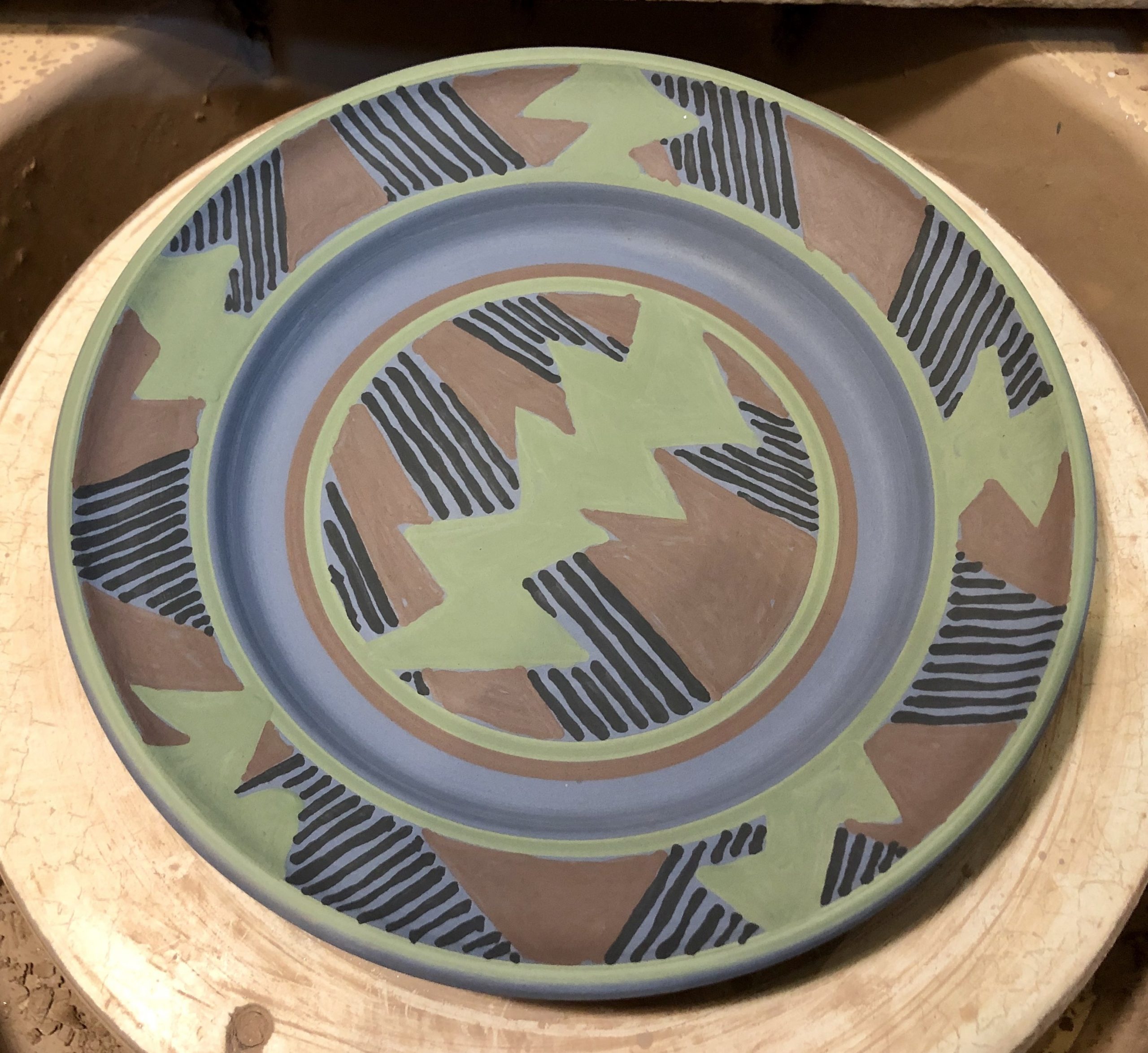
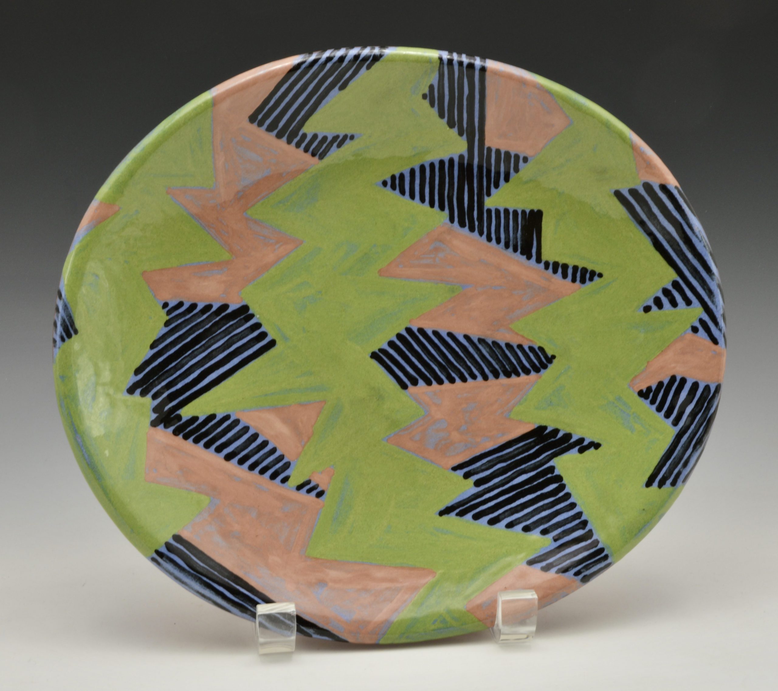
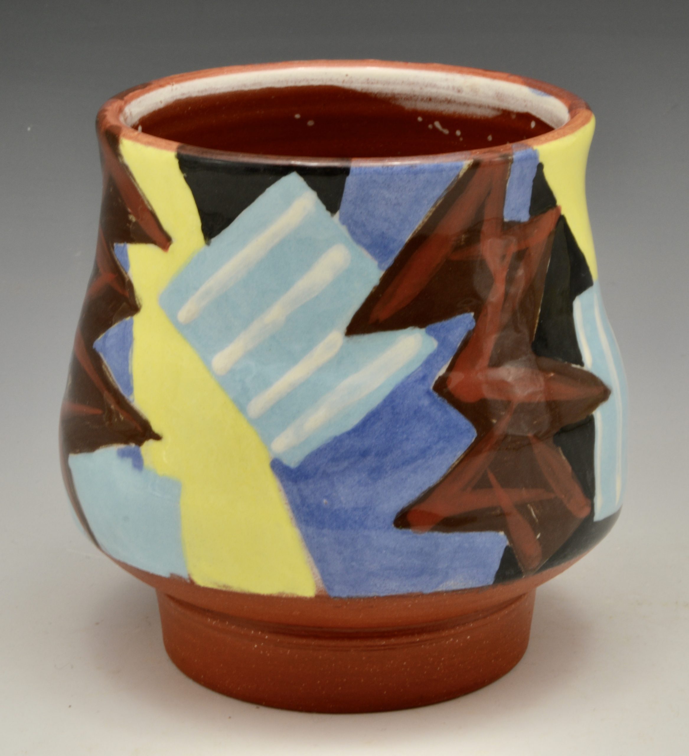
Let me show you. One lunch plate with a generous rim was my first with a new group of slip colours. All the pots in this firing were made with D’Arcy red earthenware clay so that does affect the colours applied over. With the plate on my wheel I painted it all over with my Sky Blue. Then, in a Folk Art way, I applied bands of my chosen colours before adding random angular shapes. Instead of using paper resist for jagged patterns, this time I simply painted them. I was keen to test a new mid-century pale green I’d mixed so that was painted over the blue. Then I chose a colour called Sienna but which is really a browny-pink. It turns out that all three are almost the same tone so I’m glad I added black stripes in some areas.
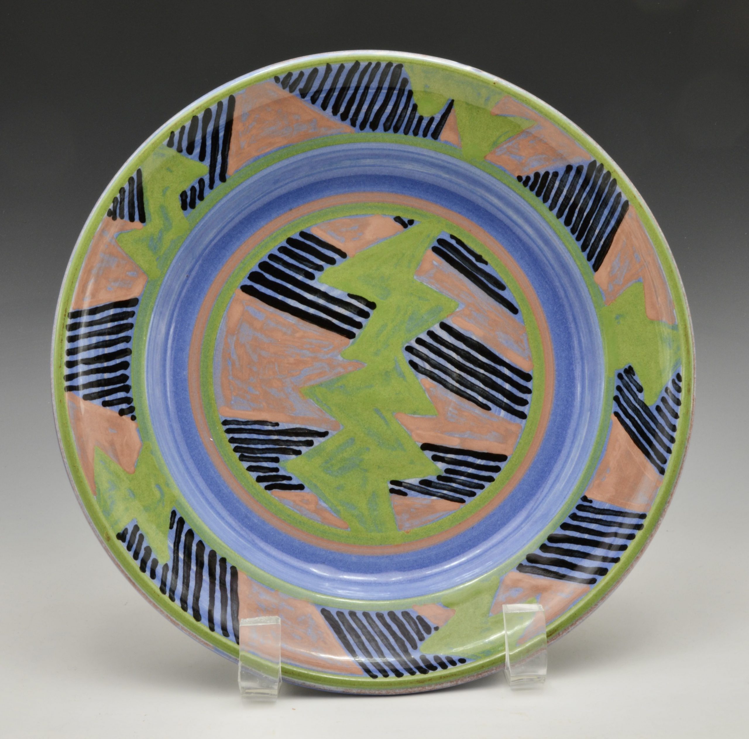
I was happy with the design when I stopped, happy to have left a band of blue for contrast and depth. You’ll see that the finished plate is still pleasing but isn’t as strong a contrast as at first.
drying
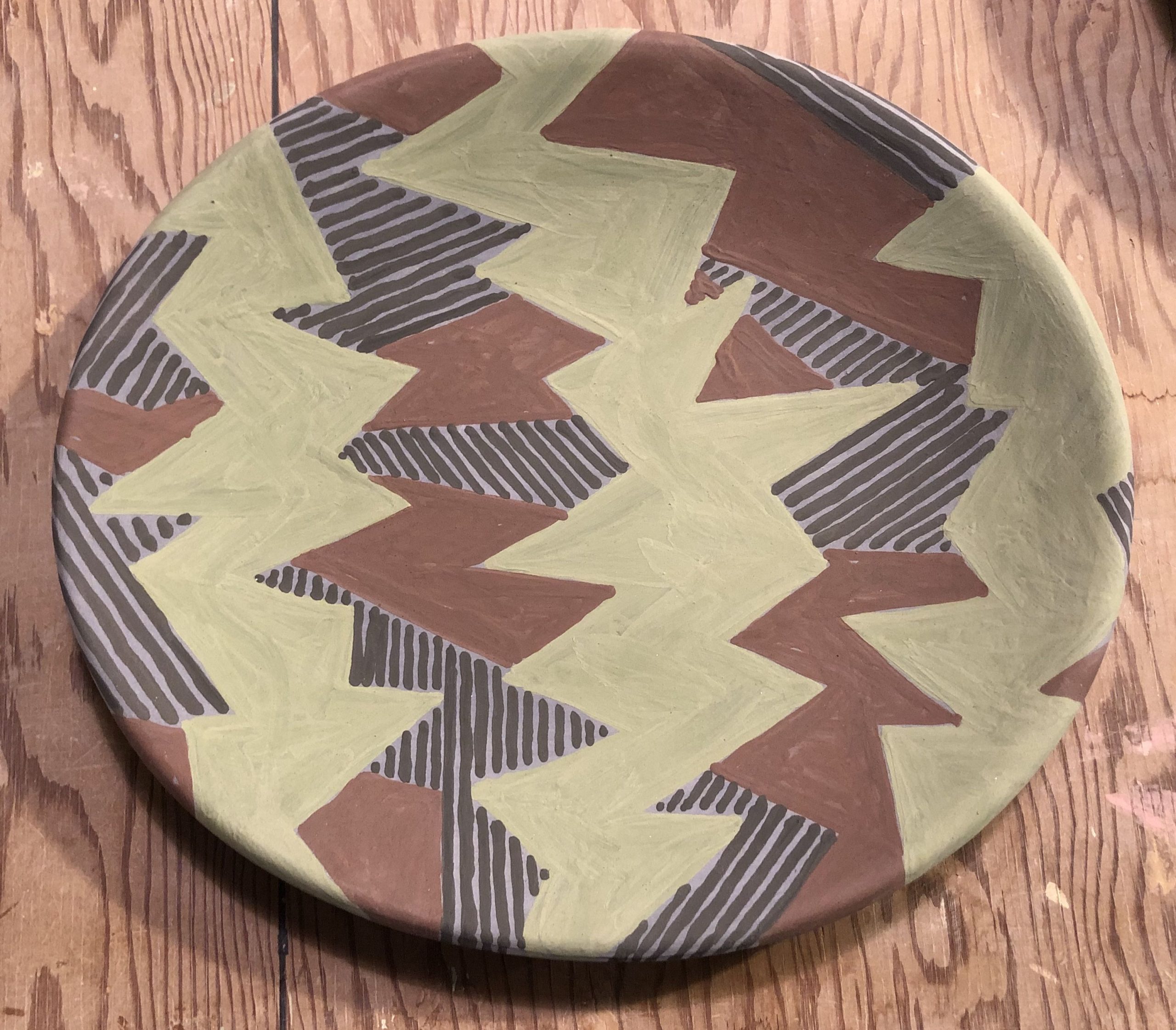
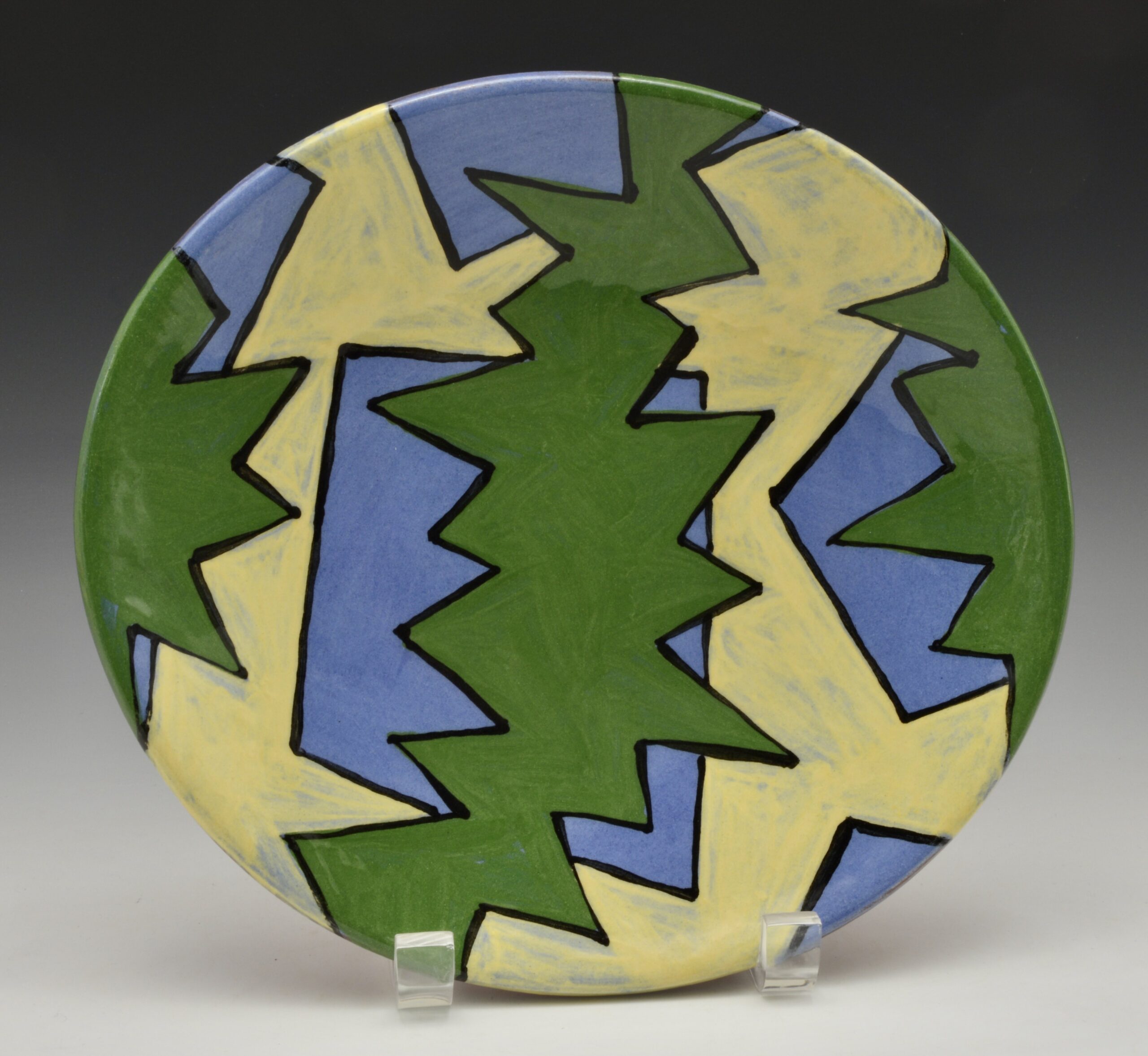
I then used the same colours on a slab plate, without the confining rim for its design. Fun! But when I finished I realized I hadn’t left any plain blue. Take a look.
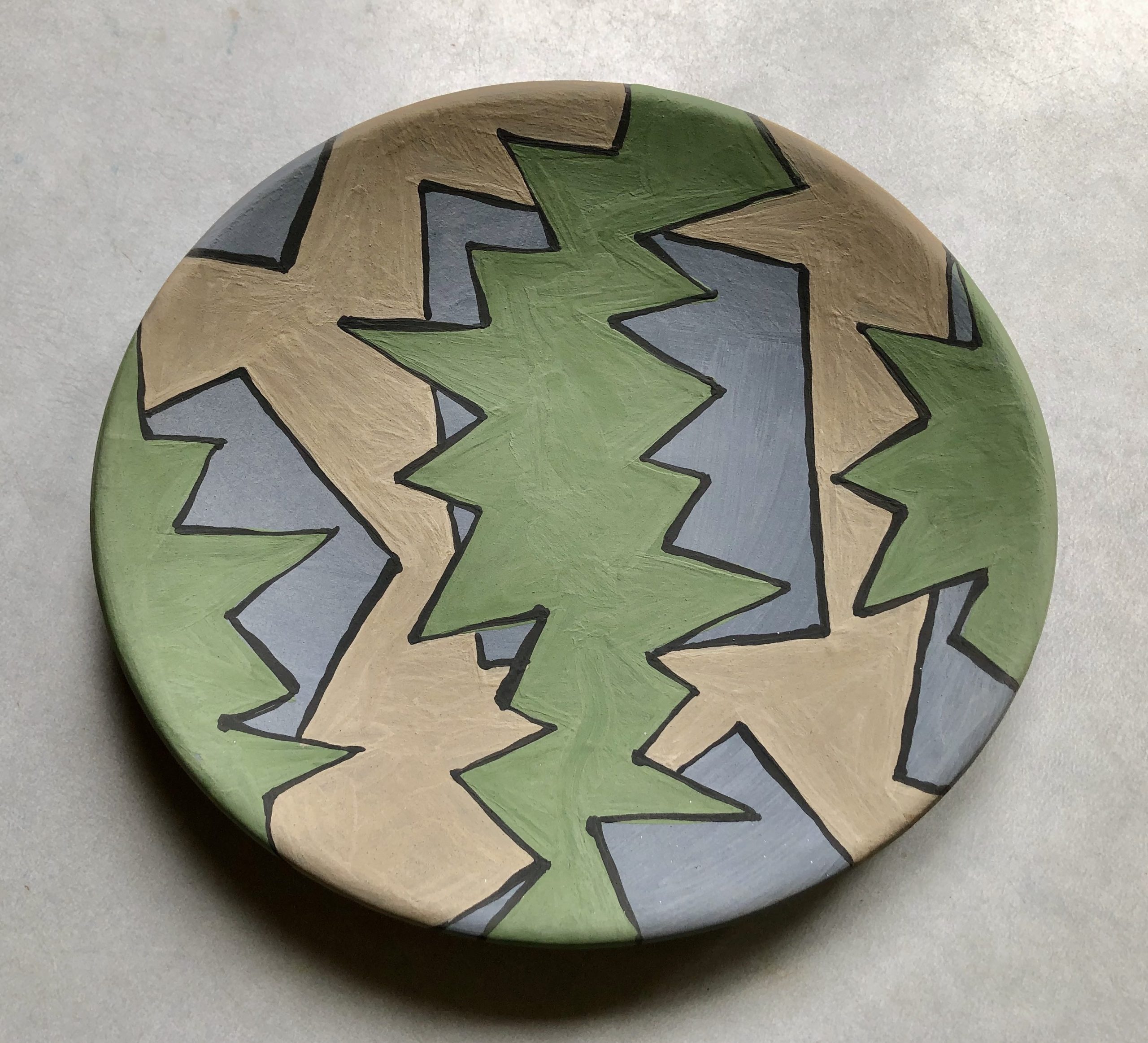
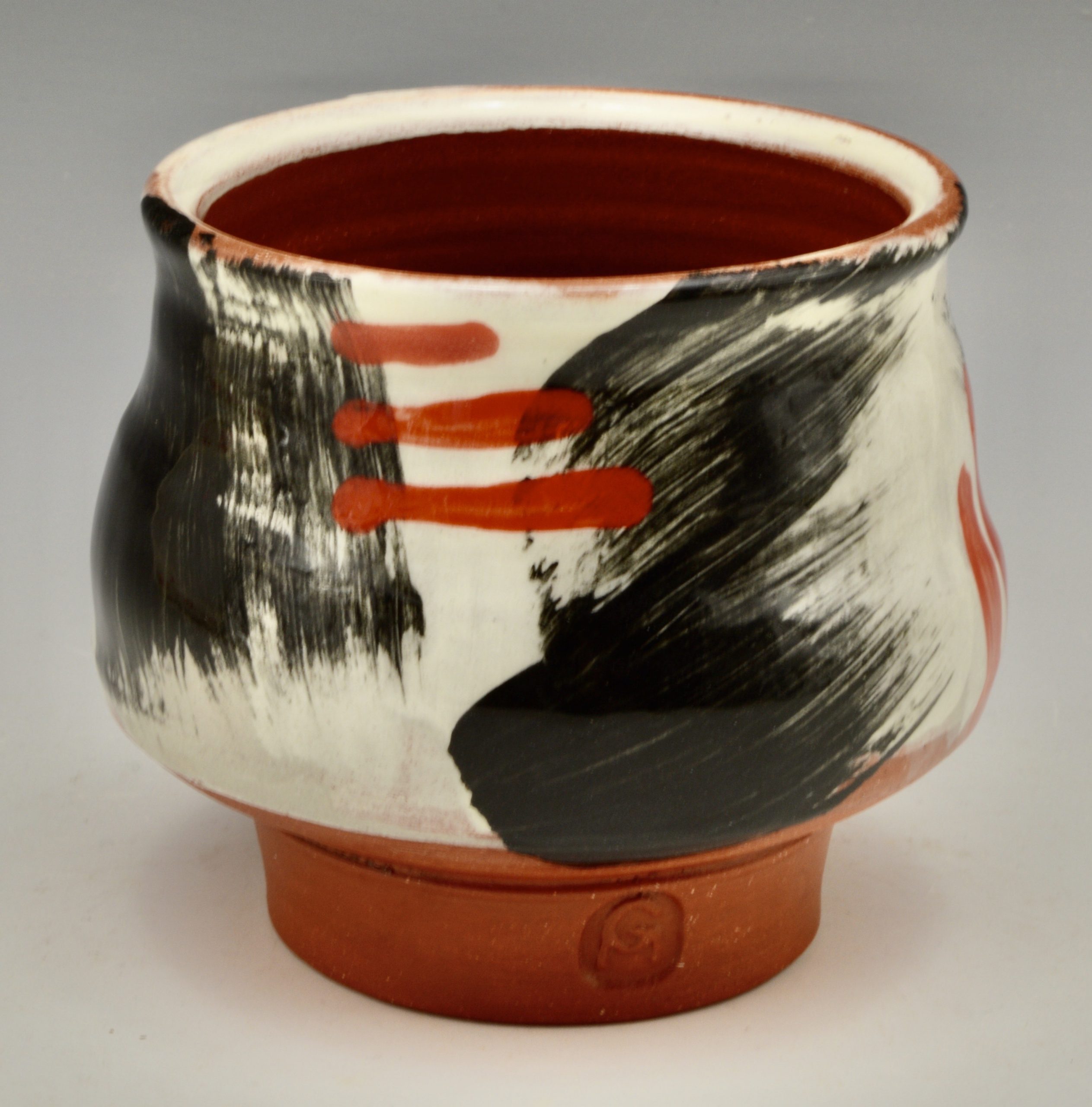
For the third I chose a darker green to paint over the pale blue and a lighter cream slip for shapes underneath, intentionally leaving blue areas. I then decided to outline the shapes with black, giving it a cartoon look. As I’ve found before, the blue goes back and the other colours jump out. This one I really like.
A small yunomi uses the same colours as the first two plates and is rather dull I find.
Another one, rather large, has wilder colours and I think I’ll do more of that.
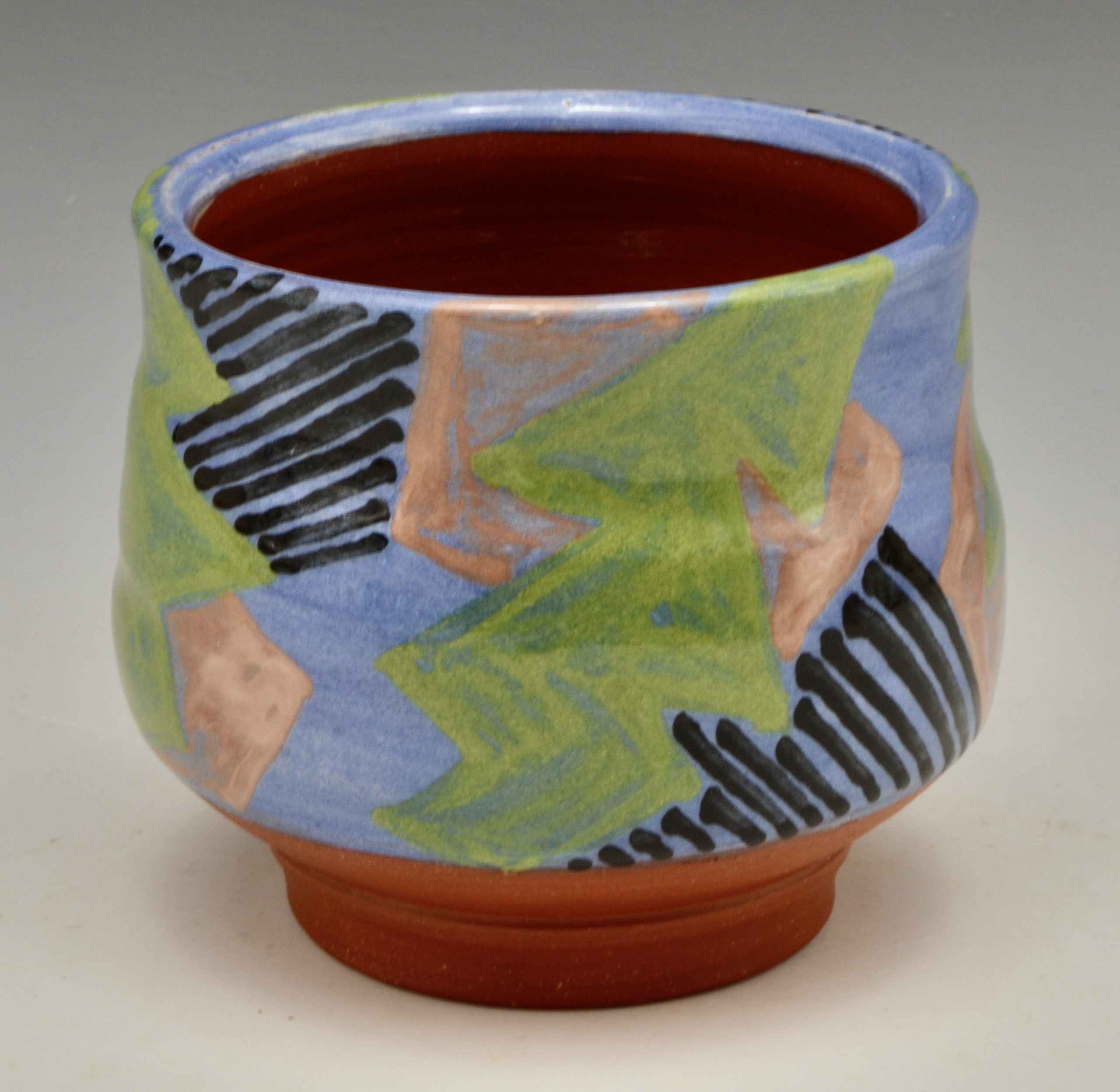
The third is my favourite and it was done last when I wasn’t too controlled. I need bright colours I thought, plus I’d just made up a batch of my intense black slip. So white, some pale grey and then the black, applied with a coarse utility brush gave a relaxed stroke. The red underglaze works well for me. I asked on Instagram and facebook for opinions and folks really liked it too! And yes Andrea M, I drink coffee and tea out of handled mugs too. Although Clary Illian and Jeff Oestreich use tea-bowls in their work and inspiringly in workshops, for me they are a lovely form but in fact I use mine as sugar bowls.
I welcome opinions and comments on any of this technical stuff. Is anybody using slips on earthenware with clear glaze? Tell me.
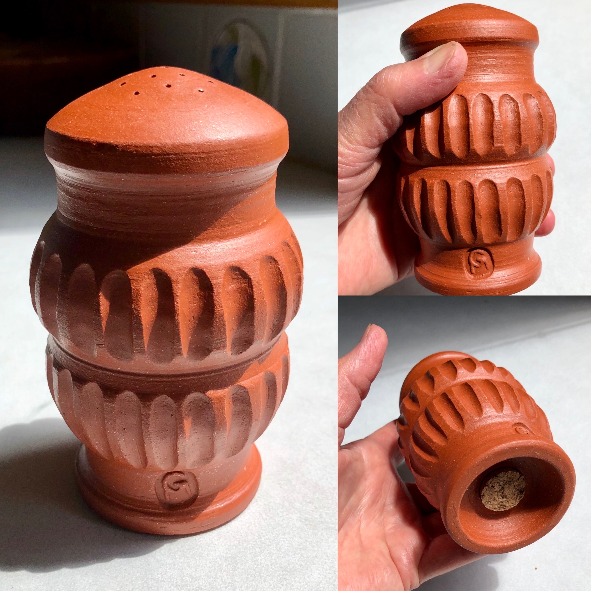
Finally I’ll add the unusual salt shaker I’ve made. It is a comfortable shape to hold, doesn’t fall over and this one doesn’t have any glaze and is finished with terra sigillata. Now that a couple of people have said they’d like one too I’d better figure out how much clay I used to make it!
Next blog I’d like to show you the harlequin series of lunch plates I made.
So great to see the new techniques and slips! The salt shaker is delicious and looks like a great fit. We miss the raids of course- there is no substitute!
Thanks Michelle. Good to hear from you.